Showing posts with label user experience. Show all posts

Aug 17, 2009

A New GNOME Control Center?


I love all the UI work and clean-up that is going on in the Linux world at the moment. Whenever a new application get's written, the UI is carefully thought through.

Recently F-Spot recieved some UI love, GIMP 2.8 is planed to introduce many user-interface improvements, new Banshee is getting a clutter based Netbook-focused interface and just today I came across a proposal for a new GNOME control center working on the preferences menus.
Without even compareing the Gnome preferences menus to the Windows Vista or Windows 7 control center, everyone will agree that the Gnome preferences menus is an unfriendly mess.

A design effort at Sun led by Kristin Travis and Jenya Gestrin has been working to 'advance' the preferences menus. Their goal is to show how the current preferences menus could change to a more simpler and direct launcher and it is looking very slick.

There's a Flash prototype (2.37 MB) showing some of the variations that were considered along the way.

Source: http://live.gnome.org/UsabilityProject/Whiteboard/ControlCenter

Apr 23, 2009

GnomeShell and Complex Design Ideas

You've probably already heard about GnomeShell, which redefines user interactions with the GNOME desktop. The project is still in early stages of development. The plan is to have it be an optional feature in GNOME 2.28, and to replace the existing components for GNOME 3.0.

On the designer playground site you can find a list of descriptions of design ideas with links to the mockups or write-ups. If you're into usability, GUI design or just curious, surf by the http://live.gnome.org/GnomeShell/DesignerPlayground

On the site you'll find images, write-ups, videos and even an interactive mockup.

The image below is a mockup made by Máirín Duffy for the Navigating Applications Menu

Feb 21, 2009

PulseAudio News

Just yesterday we looked at the Ear Candy 0.3 which is a sound level manager that nicely fades applications in and out based on there profiles. In an Email from Jason Taylor (the creator of Ear Candy) he wrote that in the future PulseAudio should be able to assign profiles through environment variables and desktop files with no UI required at all. It seems the future is already here!

Today I read Lennart Poettering' blogpost titled "Tagging Audio Streams" where he talks about exactly this. Here's a quote from his blogpost:

...PulseAudio can enforce all kinds of policy on sounds. For example, starting in 0.9.15, we will automatically pause your media player while a phone call is going on. To implement this we however need to know what the stream you are sending to PulseAudio should be categorized as: is it music? Is it a movie? Is it game sounds? Is it a phone call stream?

Also, PulseAudio would like to show a nice icon and an application name next to each stream in the volume control. That requires it to be able to deduce this data from the stream.


The feature will be available in PulseAudio 0.9.15, so will will have to wait for Karmir Koala, since PulseAudio 0.9.15 won't land in Jaunty.

Source: Lennart Poettering

Nov 16, 2008

The road to GNOME 3.0 (first draft)


This is the first draft of the road to GNOME 3.0 artwork and UI-wise. v0.0.1

Vision
GNOME 3.0 should have visual refresh. Such a major release without any or little changes could dissapoint users. No radical UI concept change, but incremental refinements around the desktop of things that have proved to work and dropping or improving/dropping things that don't, making the GNOME desktop look prettier and make it more usable. Overall it should look new but still be recognized as the GNOME desktop, but improved.
GNOME 3.0 should also be easier to design for. GNOME is highly themeable, but methods used aren't always as easy and documentation is poor. Right now designers can only adjust certain options of an existing widget theme, or depend on GTK+ hackers to make their theme work.

Events and Deadlines


Components
These are components of GNOME that the Art Team will be working on. Note that there are no seperate "art packages". The team will be working closely together with all kinds of different projects, especially on the UI work.
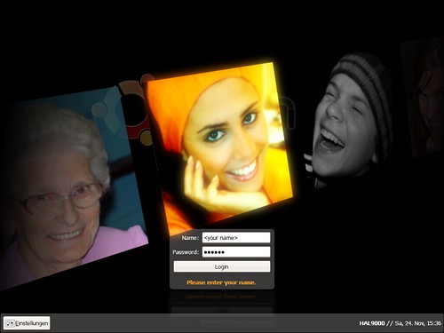
- Login screen
- Splash sceen
- Wallpapers
- UI design
- Widget themes
- Icons
- Fonts
- Animations
- Website

Ideas and Points of Discussion
Login screen
New GDM version? Seamless transition from the login screen to the desktop: prevent color flickering. Fading in of the wallpaper and panels. Making the login process a smooth transition will make it look shorter. New theme.

Splash screen (more like getting rid of it)
The splash screen is totally useless, the icons are often misaligned and it's causes two more "flashes" in the login process. A lot of distributions are already turning it off by default.

Wallpapers
GNOME 3.0 should have some new wallpapers. A contest could be held, it turned out very well for GNOME 2.24. Does anyone really use patterns? We haven't added any new ones in the latest 2.24 wallpaper update.

UI design (Note: think of "layout" instead of "looks")
Window list applet update, include an optional "dock mode" with basically bigger icons? Notification area applet update, better spacing. [1] Clock update applet, The date can be less eyecatching, and the time more. [2]

Widget themes
GTK engine(s) that let's the designers have control, instead of tweaking certain options. Make spacing themeable? New theme.

Icons
Follow the naming specification, ignore everything else. [3] Applications should have a hires icon. More use of hires icons where they are appropriate. Tango Next Generation (Mango) icon theme as the default theme now that the licensing is going to be LGPL? [4] Yellow colored Foxtrot folders? [5]

Fonts
Bitsream and Dejavu are quite spacious, a condensed type kan show more text in the same space without losing readability. Nicer smoother fonts that look great bold as well, a good bold font is important for dialogs etc. and where you want attention on the text Use color tints in UI (have a secondary font color?)

Animations
Subtle smooth effects that increase usability and are pleasing to look at. (think Banshee [6])

Website
The current gnome.org website looks like it's from the 90's. It may give people a wrong impression about how modern the GNOME platform really is.The GNOME 3.0 break is a great opportunity to create a new (think Web 2.0) website.

References
[1] http://www.bomahy.nl/hylke/blog/ugly-notification-area-in-gnome/
[2] http://www.bomahy.nl/hylke/blog/pretty-gnome-clock/
[3] http://standards.freedesktop.org/icon-naming-spec/icon-naming-spec-latest.html
[4] http://jimmac.musichall.cz/i.php?i=Tango-NG
[5] http://www.andreasn.se/blog/?p=21
[6] http://banshee-project.org/

http://www.bomahy.nl/hylke/wip/gnome-art-roadmap-draft.pdf

Nov 8, 2008

User experience, bling and eye candy


Canonical have for months been hiring designers and user experience staff. It has taken much longer than they hoped, but in January/February hopefully a new team will be in place. Whether their initial work will make a dramatic visual impact on Jaunty, no one knows yet. At the Ubuntu Open Week Thusday 6. November 2008 Mark Shuttleworth made this statement in a Q+A session:

...I know that other work, on the user experience front, will land, but i'll keep some surprises in store till later.

You can grab the whole Q+A session on the Ubuntu Open Week wiki.

The new team, the Canonical Desktop Experience Team, is coming together, but recently Mirco Müller (aka the king of bling) registered a new very interesting team called Bling Brigade.
Both teams looks very promising (and very much alike) in the case of bringing a greater user experience, bling and eye candy to the linux desktop.

Let hope these new teams will succeed. If your unfamilliar with Mirco Müllers work, you can be enlightened be the video clip below or check his website http://macslow.thepimp.net/

UPDATE: The video seems to be down at the moment so here's the direct link: http://macslow.thepimp.net/projects/lowfat/preview-1.avi

Oct 29, 2008

Change the default screensaver from black to ubuntu logo

For a while I've tried to get the Ubuntu desktop team to change the default screensaver from black to the animated floating ubuntu logos, but with no luck.

The problem with the current screensaver is that the first time you meet it is when the screen suddenly turns black during the installation. That is very confusing for most users, as the first thought always is that the installation has crashed.

To avoid this confusion and help brand Ubuntu I therefor suggested that floating ubuntu should be default screensaver. This could not be done since saving power is a higher priority - witch seems like a very good reason to decline this suggestion (You can read the debate on the maillinglist links below). So on the 20. October 2008 I added yet another suggestion using both the floating ubuntu screensaver and the powersaving mode.

After five minutes the floating Ubuntu screensaver would start, and two/three minutes later again, the screen would go into a power saving mode.


To me it seems this would solve both our problems and the solution is even very simple to incorporate. However, nine days later not a single reply has been posted on the matter! Why is that?

https://lists.ubuntu.com/archives/ubuntu-desktop/2008-August/date.html
https://lists.ubuntu.com/archives/ubuntu-desktop/2008-July/date.html
Brainstorm